Led UX, visual design, and digital strategy across 20+ active agency accounts, creating responsive websites and landing pages from research and IA through design, iteration, and launch.
REDESIGN
Homepage Heroes
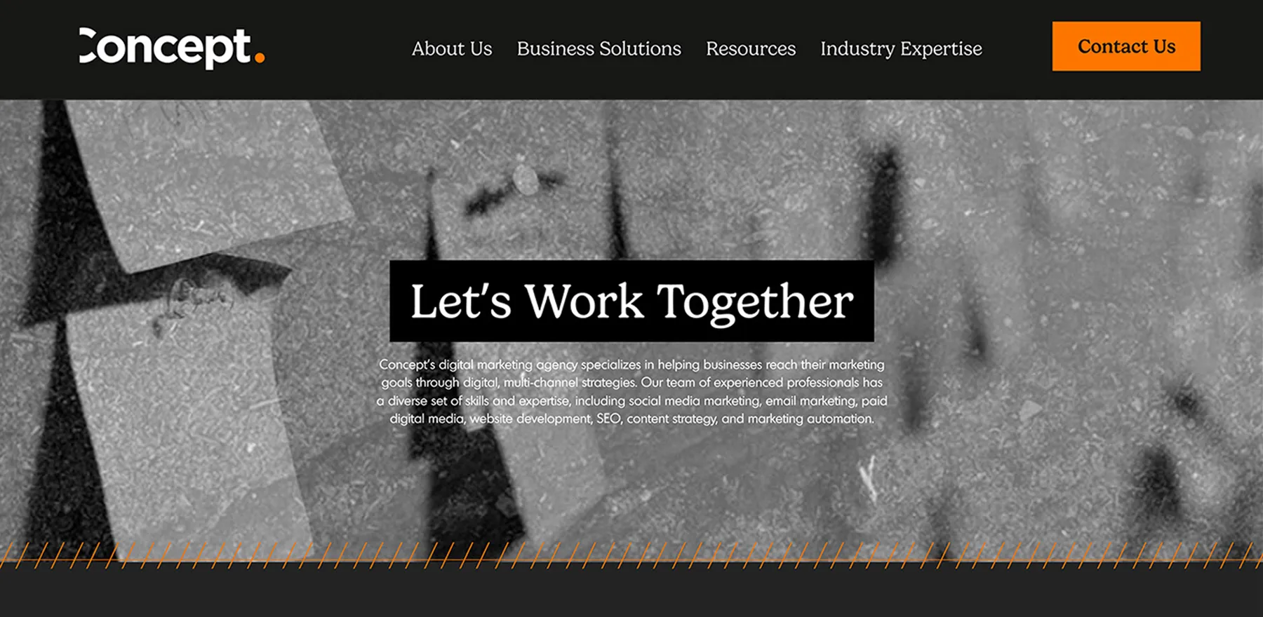
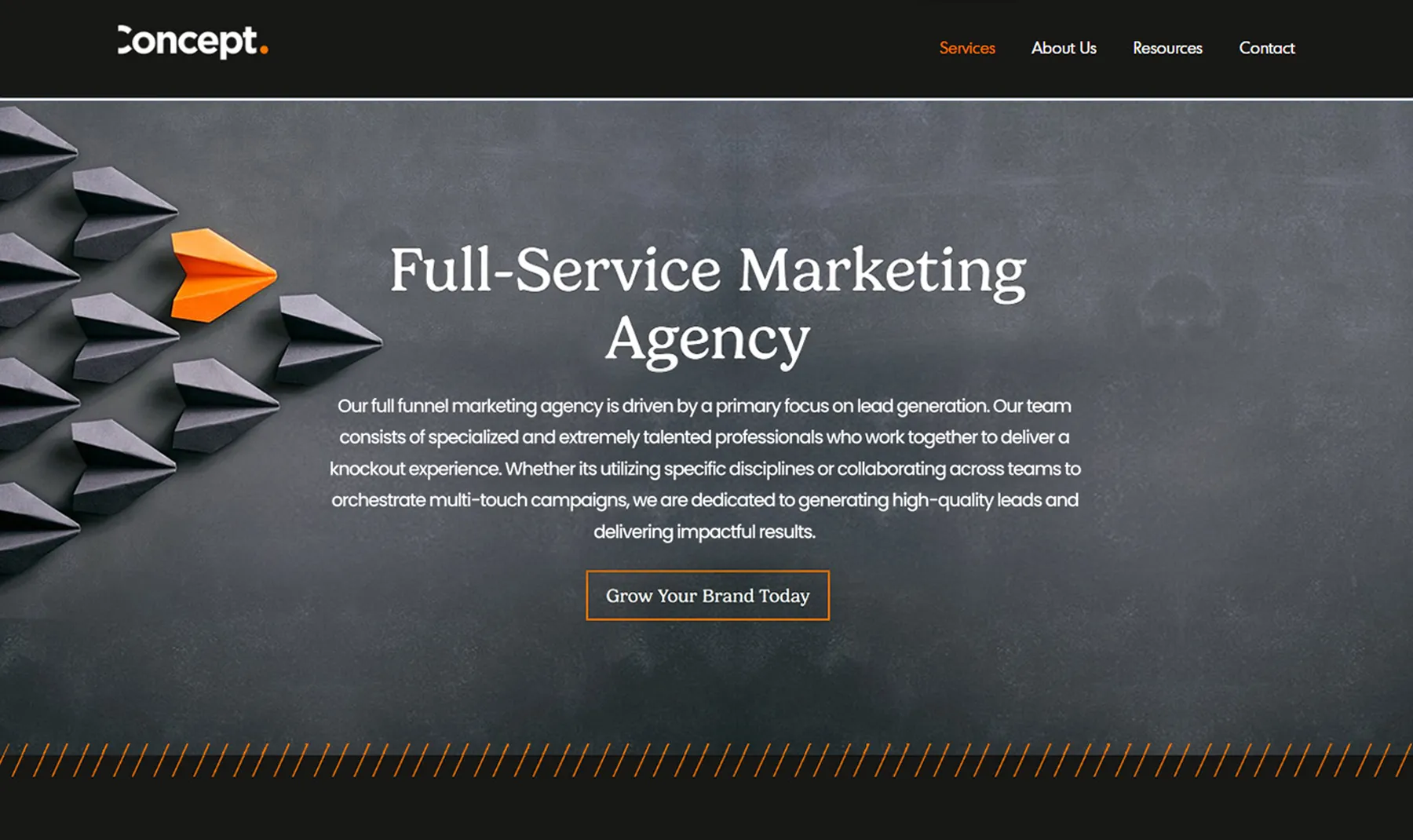
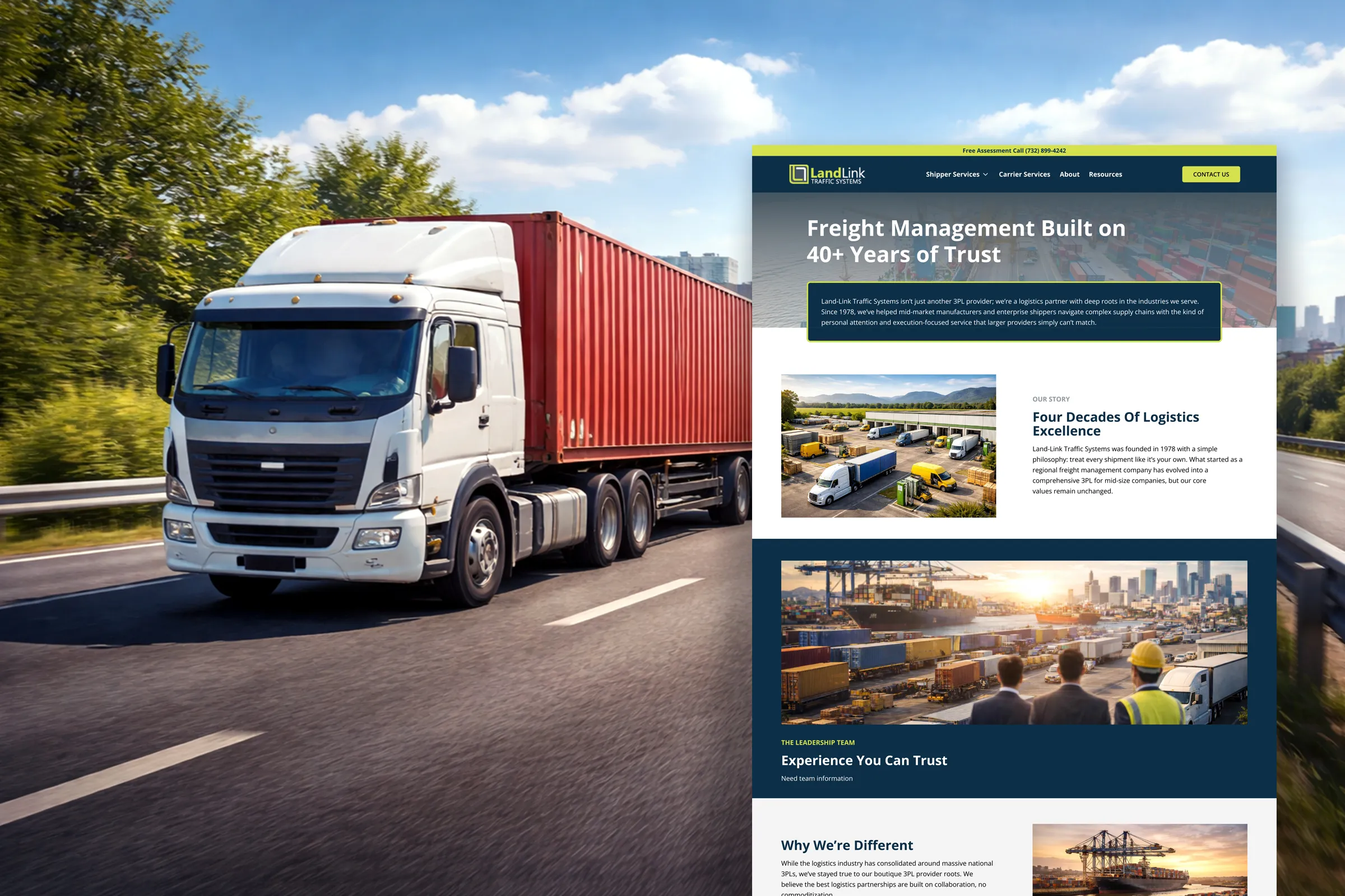
Reworked an overly dark, visually inconsistent homepage with sharper imagery, stronger brand color, and clearer hierarchy, creating a more inviting and distinctive entry point and better use of above-the-fold real estate.
• Brighter visuals • Stronger branding • Specific messaging • High contrast text
STANDARDIZATION
A/B Testing CTAs
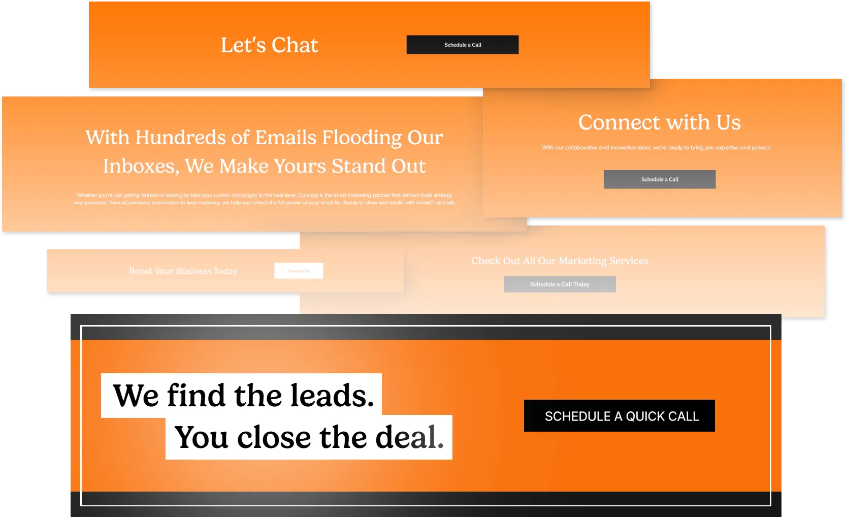
Consolidated inconsistent CTAs into a clear, reusable system with distinct actions and differentiated components for contact or informational content. Testing validated the new approach for site-wide adoption.
One system, Countless Brands
Microsite Templates
DESIGN SYSTEM BUILDING
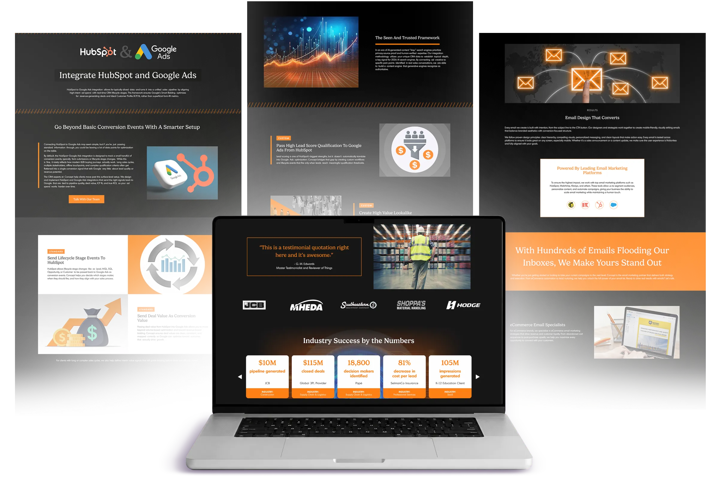
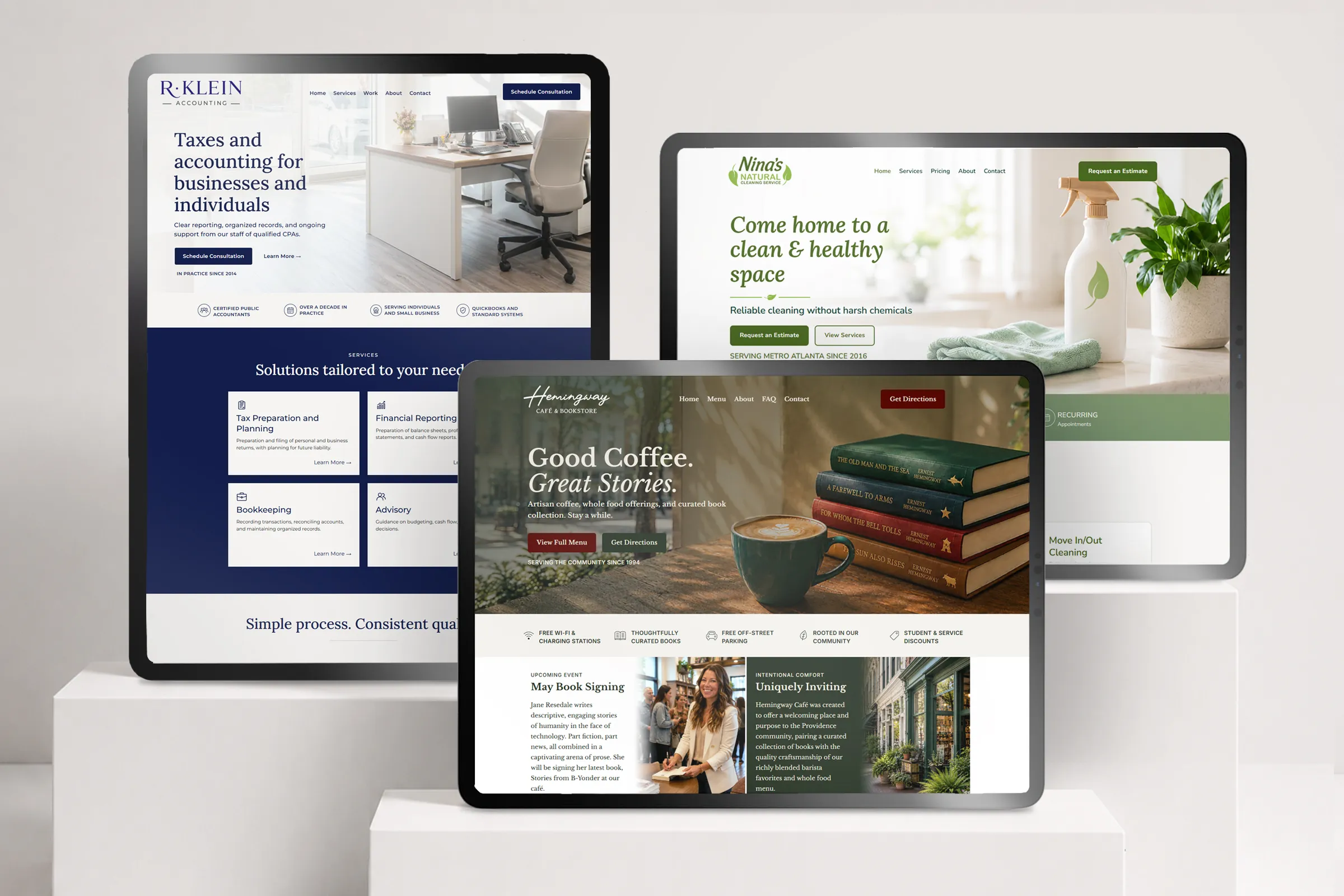
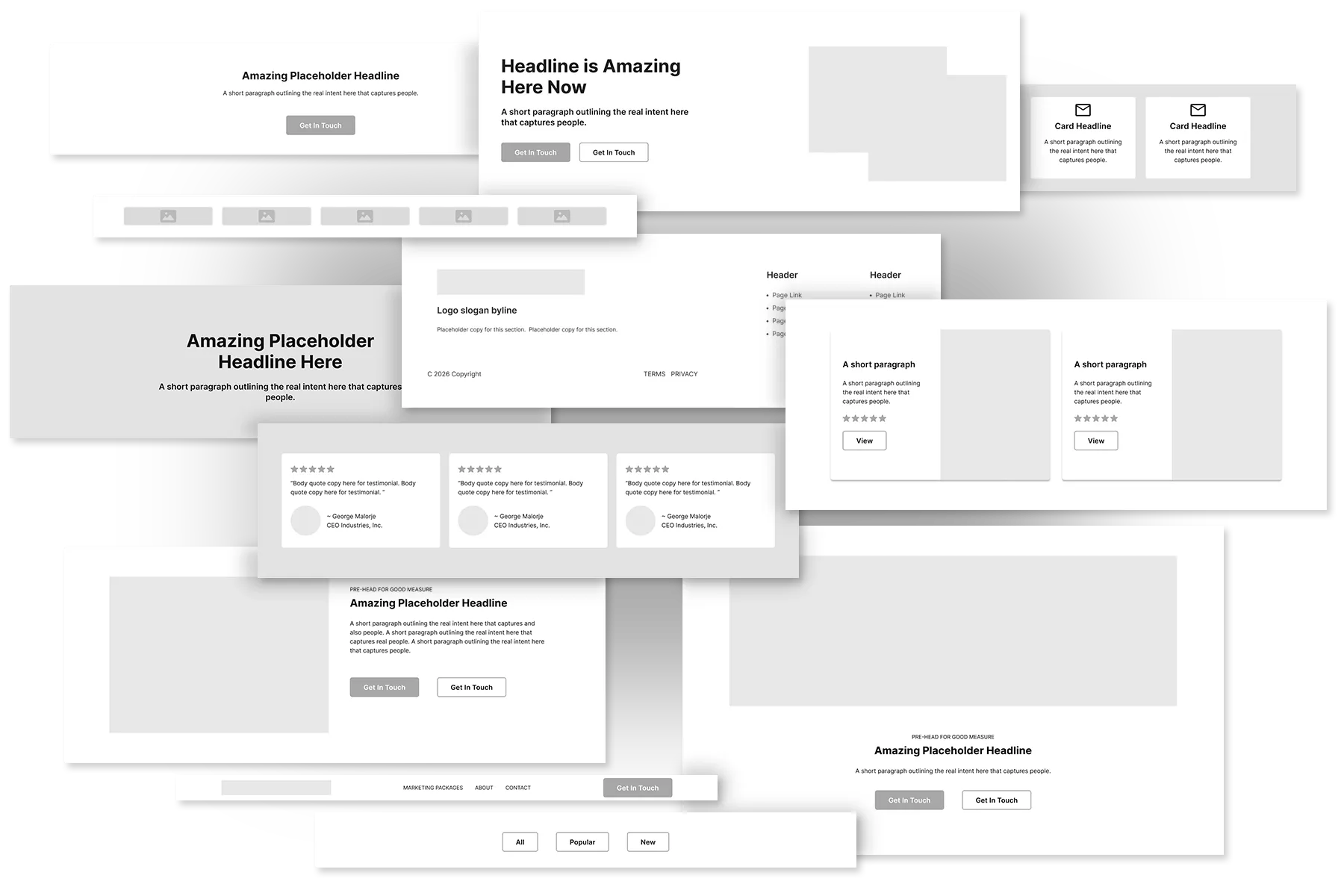
Created a flexible template system for efficient website production and built three complete, uniquely branded sites from the same underlying structure.
FLEXIBLE COMPONENTS
Component Variations
A shared framework adapts through imagery, typography, color, and content without sacrificing individuality.
BRAND SYSTEMS
Distinct Branding
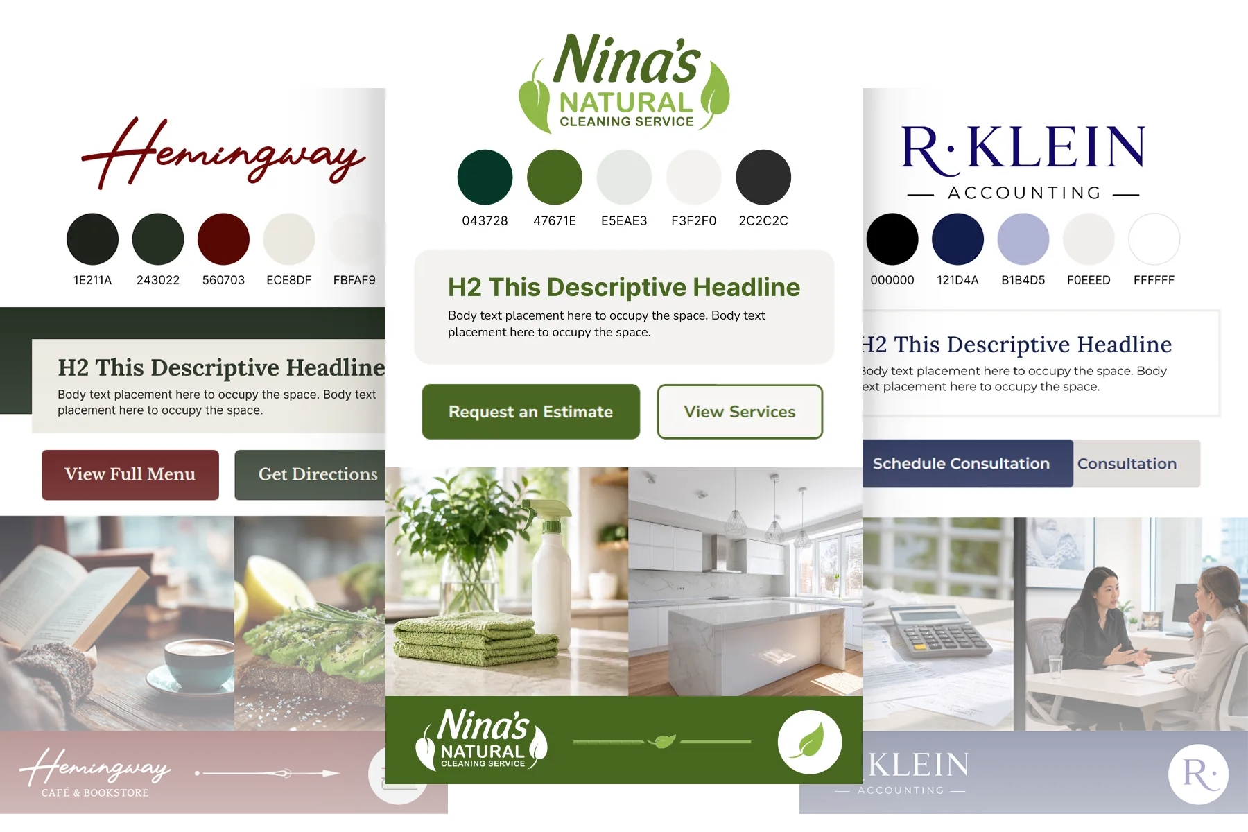
Brand-specific styles and defined visual rules keep each experience recognizable within the larger component system.
RESPONSIVE DESIGN
Built for Every Screen
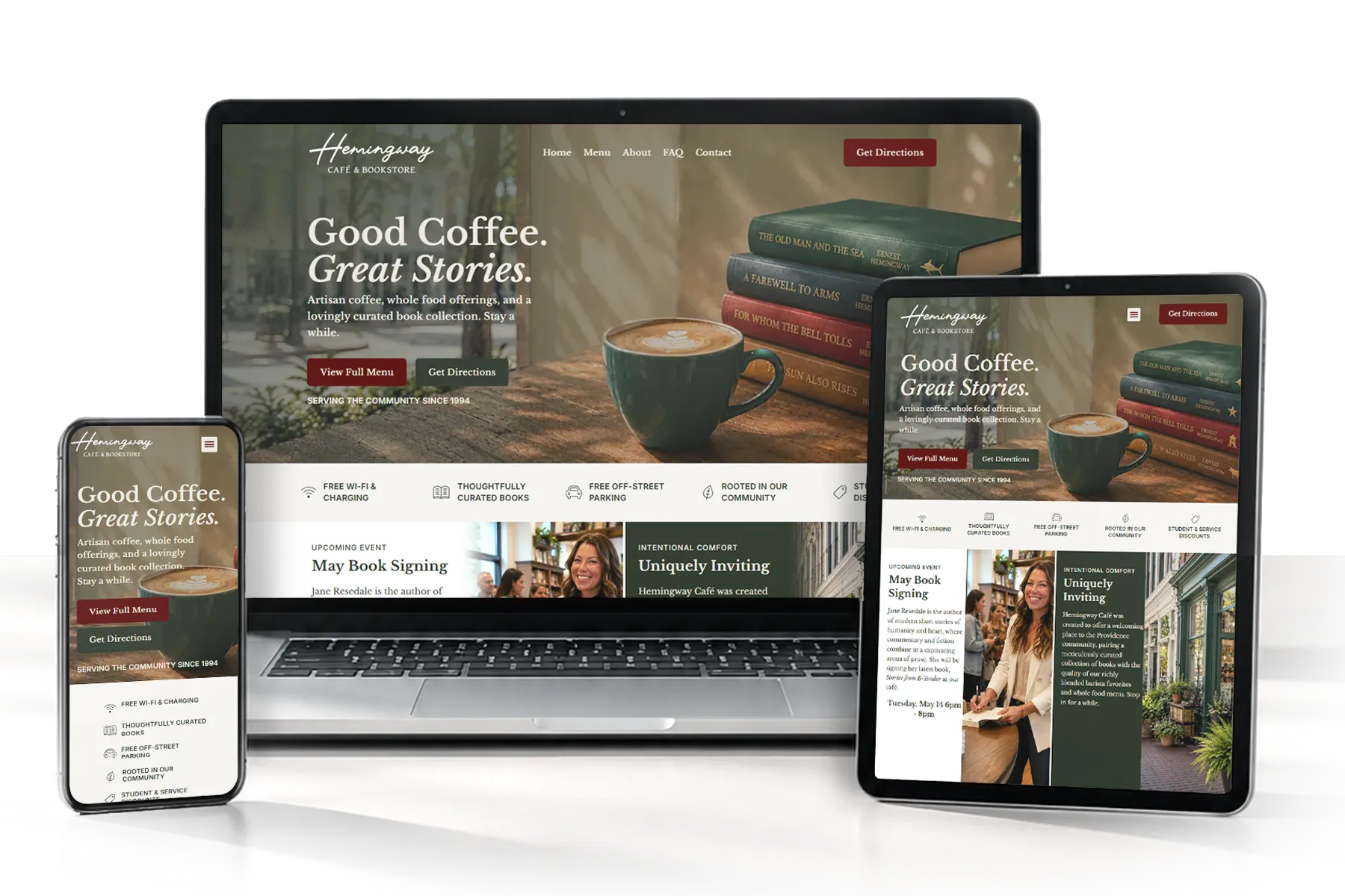
A responsive component system maintains hierarchy, usability, and brand expression across desktop, tablet, and mobile.
Improving Everyday Interactions
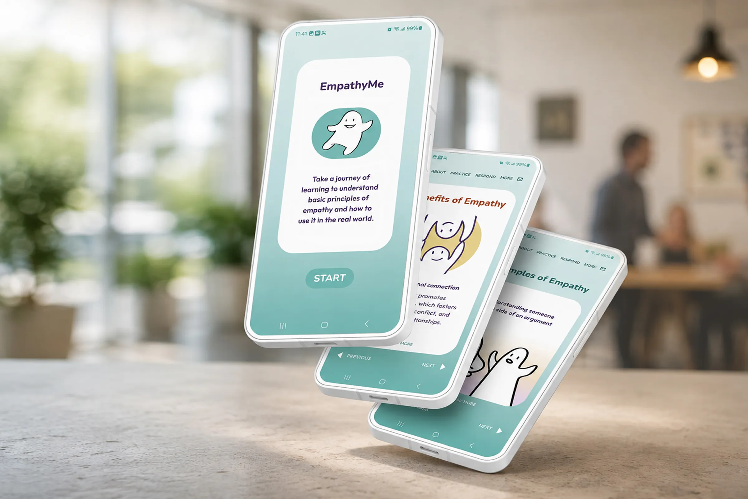
EmpathyMe
MOBILE LEARNING APP
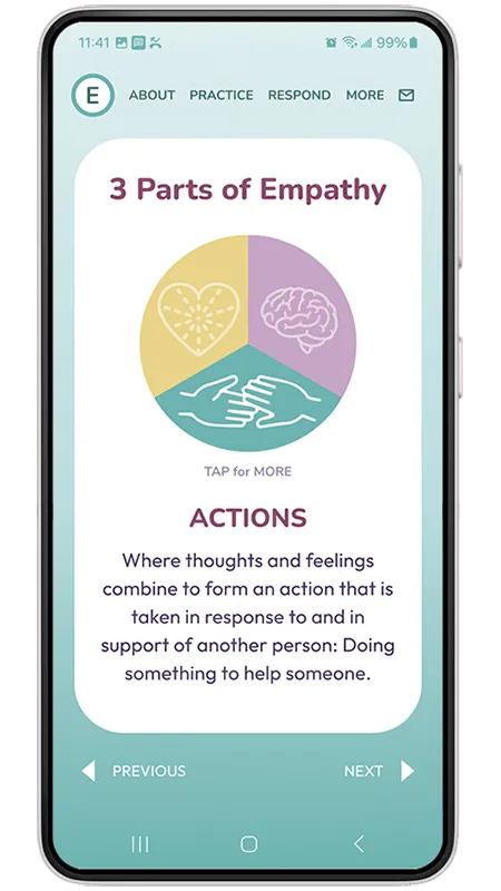
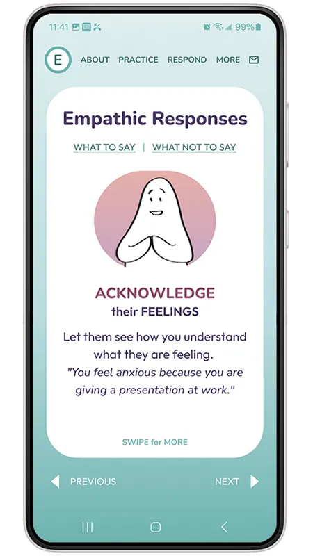
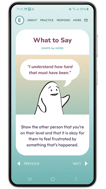
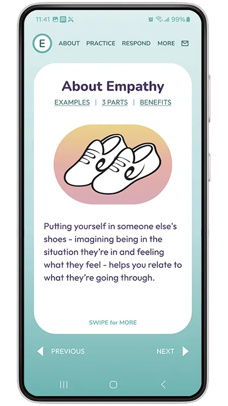
Created a mobile learning experience with short, interactive lessons to help people easily understand principles of empathy and how to apply it in real life.
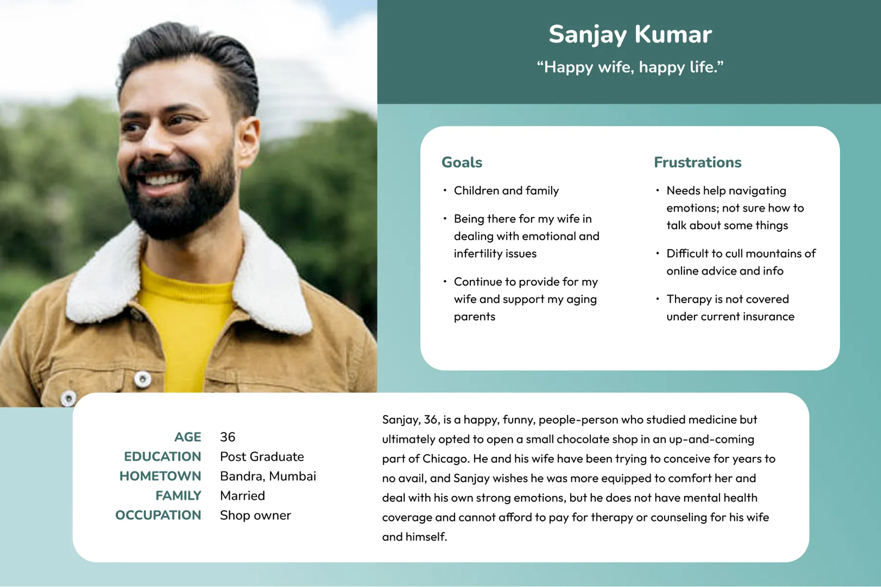
RESEARCH
Understanding the User
Interviews, surveys, competitive research, and personas.
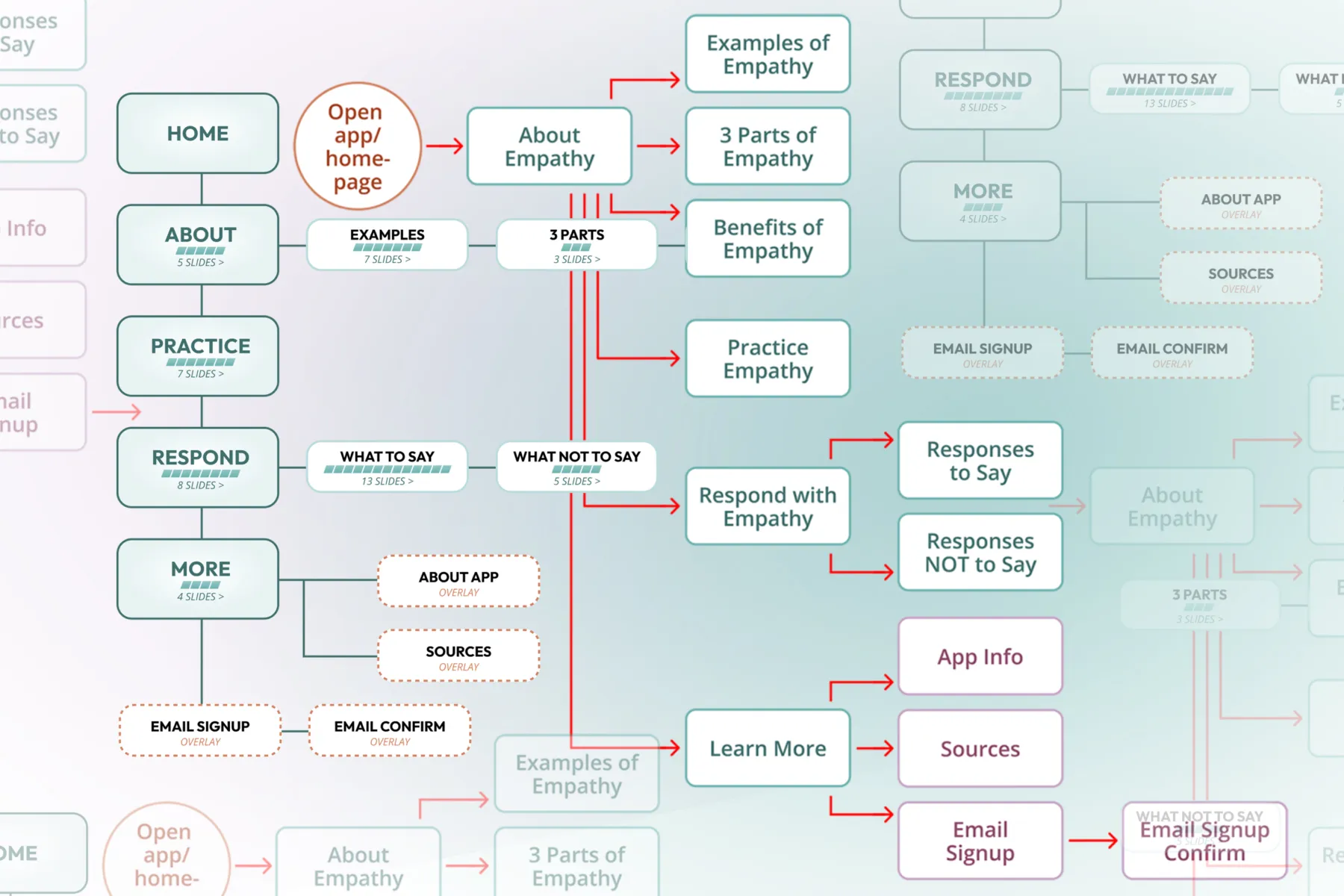
PRODUCT DESIGN
Implementing Insight
User needs translated into a sitemap, flows, and early wireframes.
TESTING + ITERATION
Refining the Experience
Usability testing informed revisions to navigation, lesson content, and interactions.
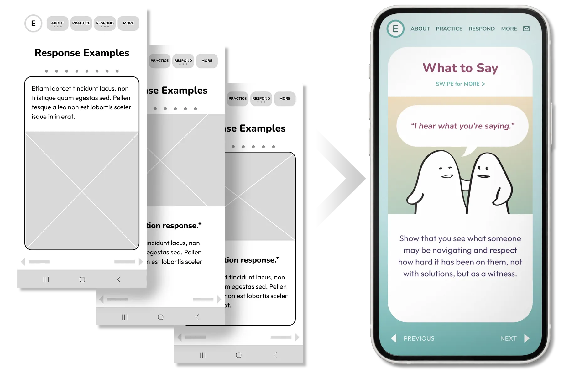
FINAL PRODUCT
Hi-Fi Prototype
A complete responsive design system and interactive mobile experience.
Redesigned a content-rich logistics website with improved pathways and stronger hierarchy to create a responsive experience that clarifies complexity.
INFORMATION DESIGN
Content Hierarchy
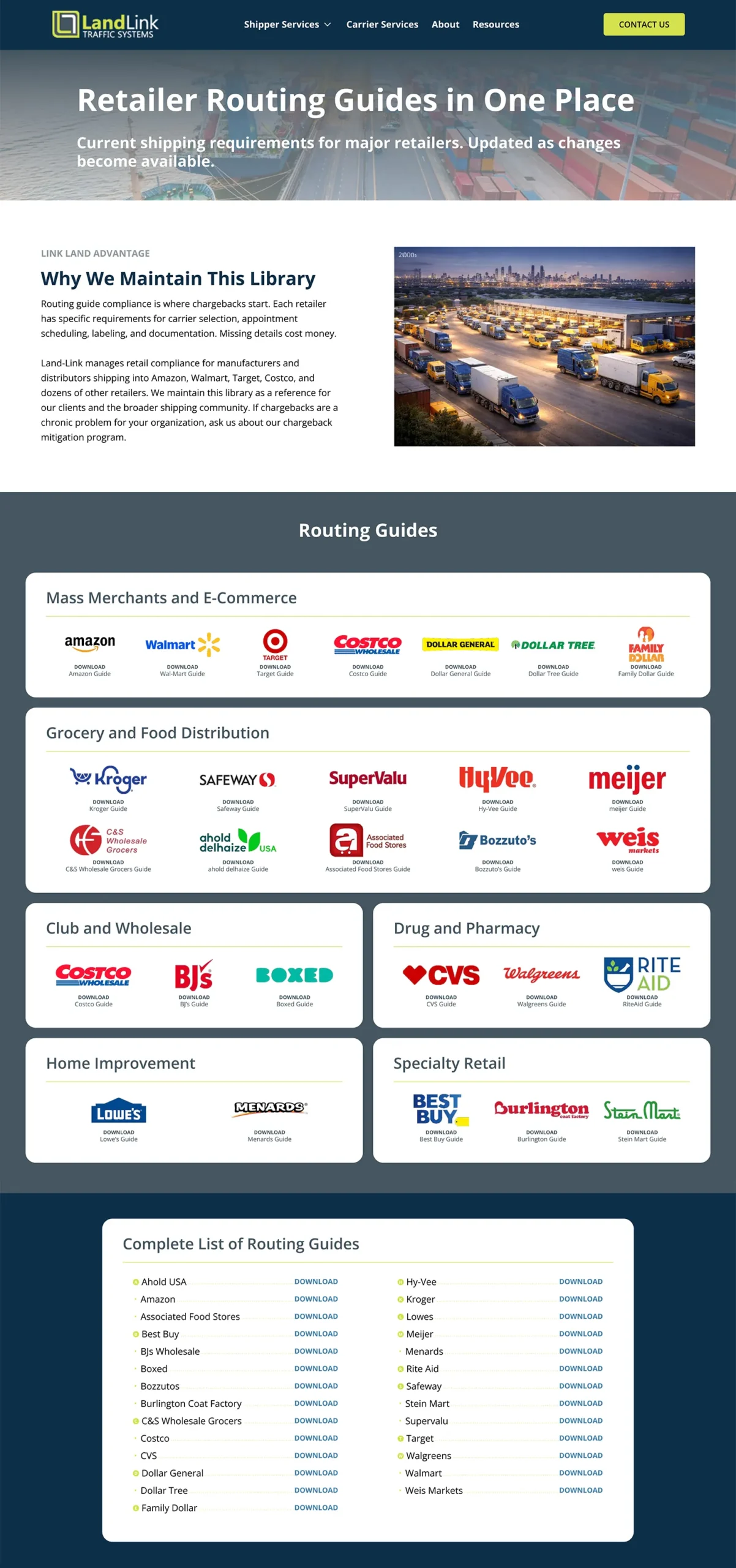
Restructured dense service information into scannable pages with clear hierarchy, creating a system that effortlessly accommodates future updates, additions, and changes.
INFORMATION ARCHITECTURE
Clear Paths Through Complexity
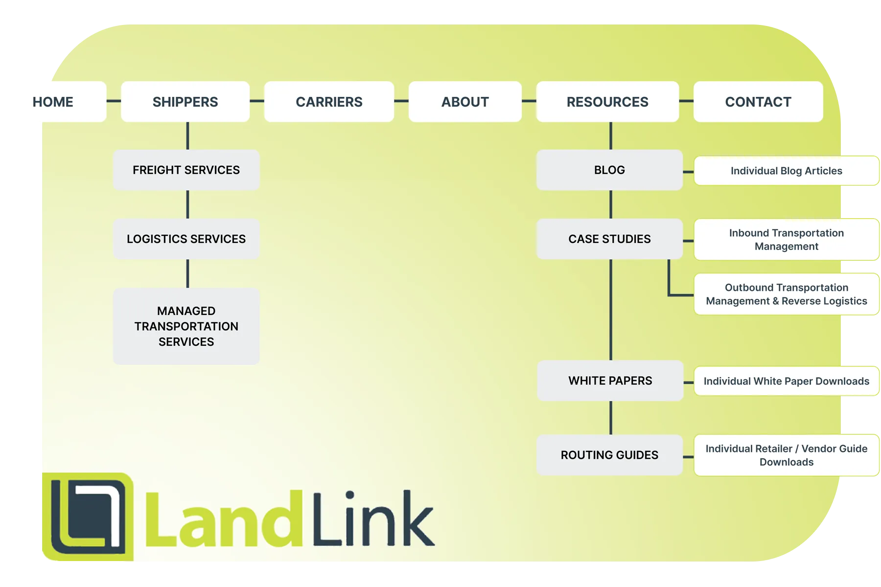
Built a scalable architecture for blogs, case studies, white papers, routing guides, and other resources, organizing an extensive content library into clear categories and pathways that make information easier to access.