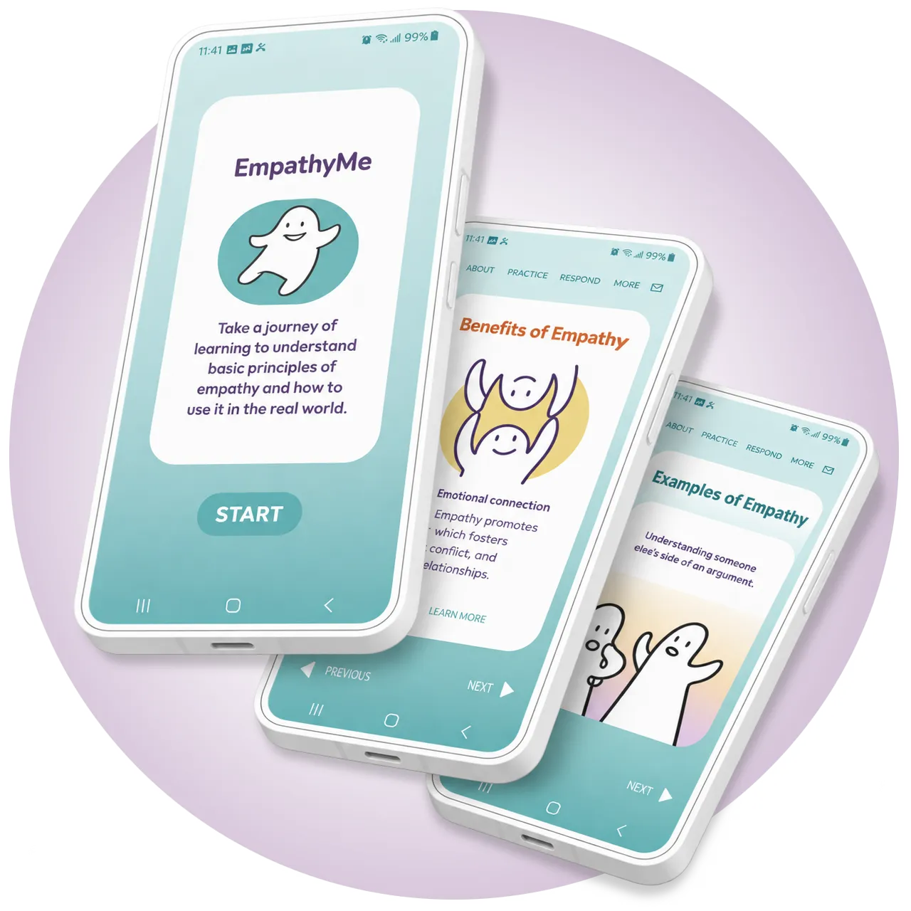
A mobile learning experience designed to make empathy easier to understand, explore, and apply through short, interactive lessons.
CHALLENGE
Information about empathy and its practical application can be difficult to find in one accessible resource.
GOAL
Create an engaging resource that teaches foundational empathy concepts through practical, real-world applications.
USER RESEARCH
Discovery
Objective
I researched how users felt about learning interpersonal skills through a digital product, how they might interact with it, and where an app could offer unique value.
Feedback helped identify the right depth of content: just enough to introduce new concepts without overwhelming users. I also accounted for my own bias toward psychology by deliberately seeking varied perspectives.
Participants
A demographically diverse group with varied knowledge of empathy and different contexts for applying it.
Methods
Surveys, interviews, and observational studies. Secondary research revealed few comparable products, suggesting an opportunity in the market.
PAIN POINT
Required Registration
Asking for information before allowing access forces users to invest before understanding value.
PAIN POINT
Worth Downloading
Users expect an app to offer a richer experience than a basic internet search.
PAIN POINT
Real World Connection
Psychological education often stops short of showing how concepts apply to everyday life.
RESEARCH SUMMARY
Understanding the User
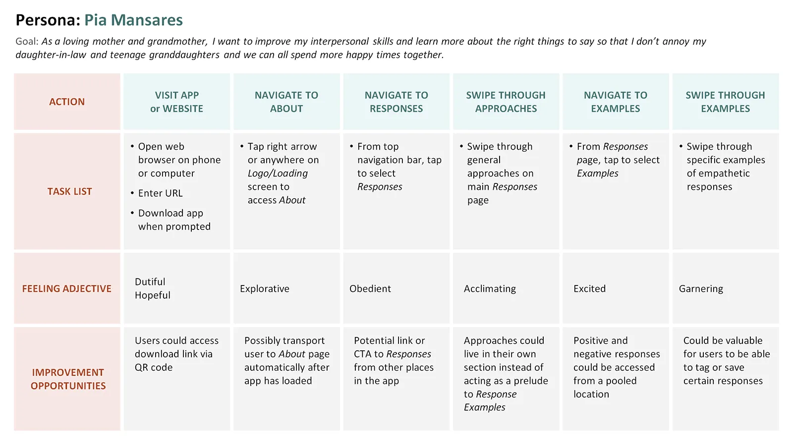
Persona: Pia
“As a loving grandmother, I wish I knew the right thing to say so that I don’t annoy my daughter-in-law and we can all spend more happy times together.”
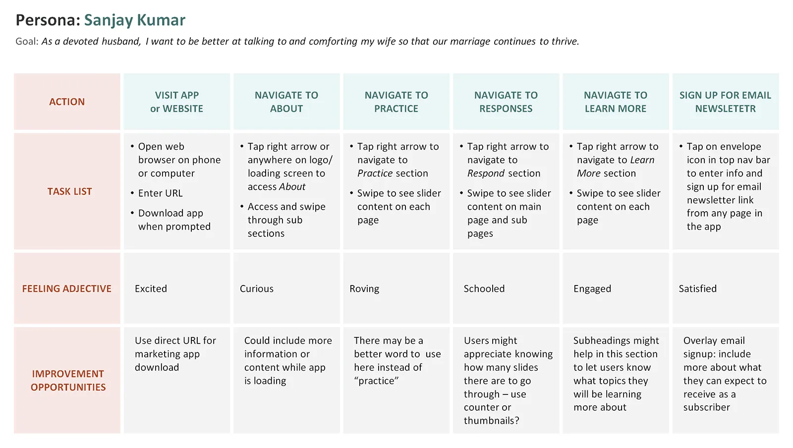
Persona: Sanjay
“As a devoted husband, I want to be better at talking to and comforting my wife so that our marriage continues to thrive.”
EXPERIENCE
Designing for User Needs
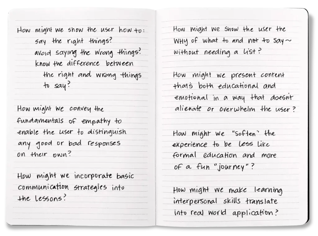
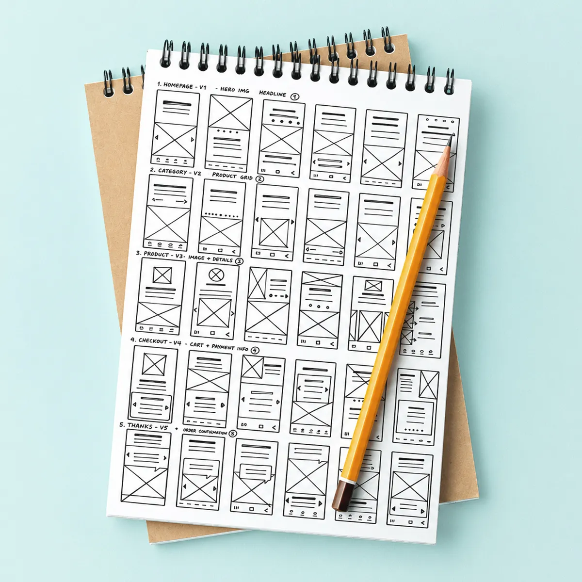
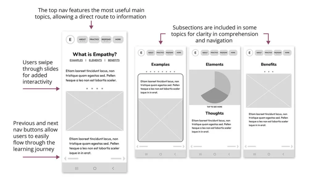
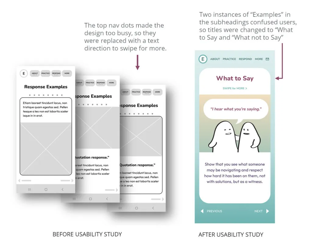
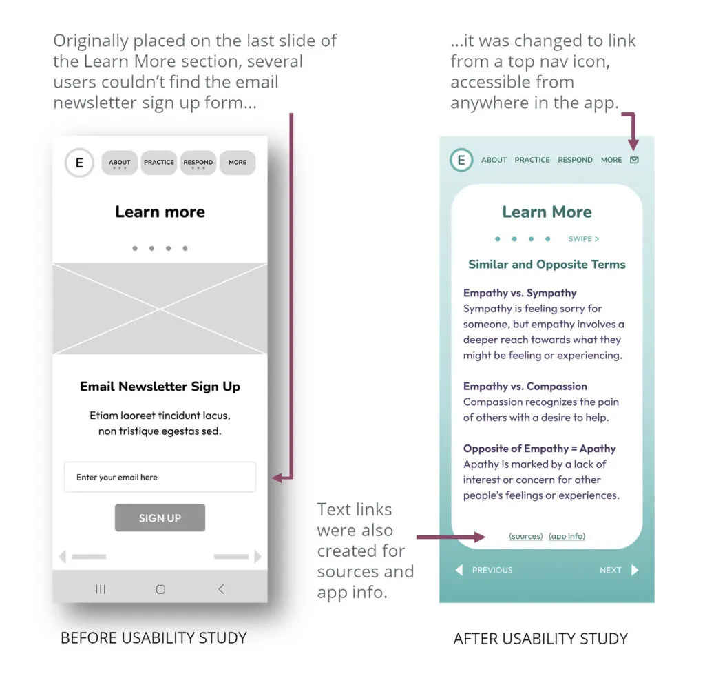
Ideation Potential improvements were explored through Rapid Drawing and with brainstorming exercises including “How Might We?”